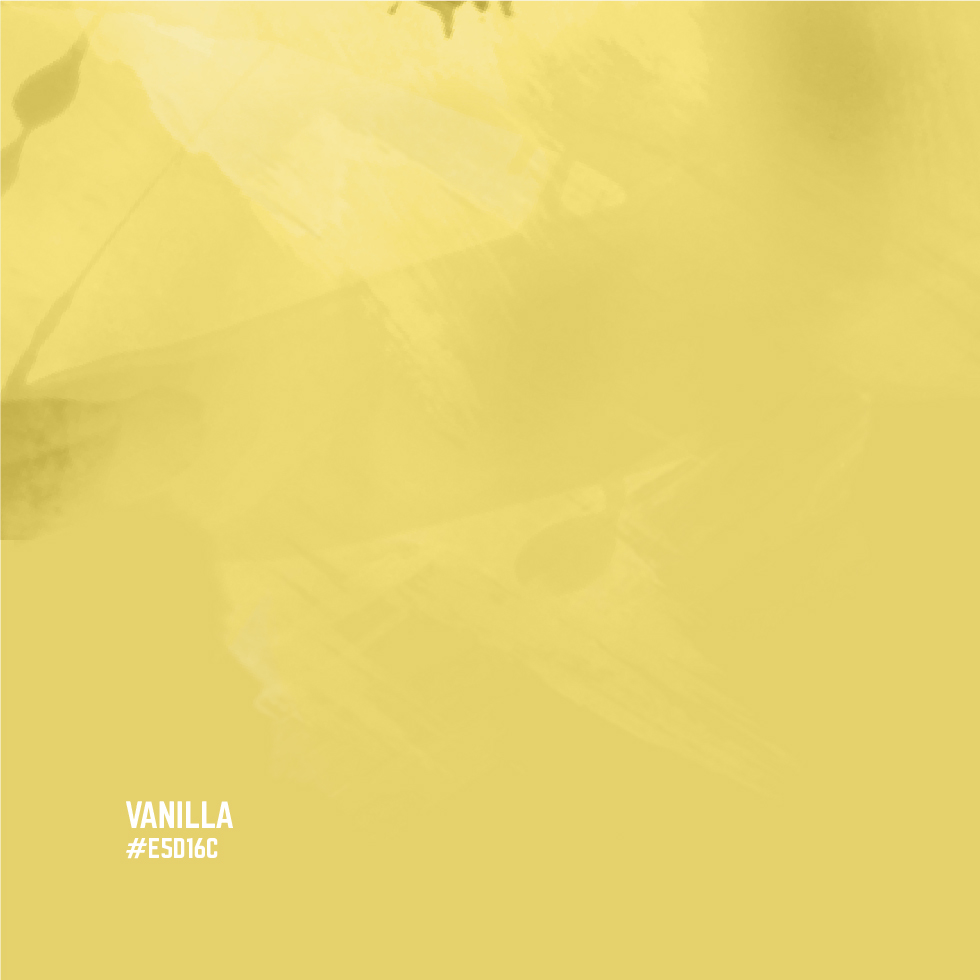
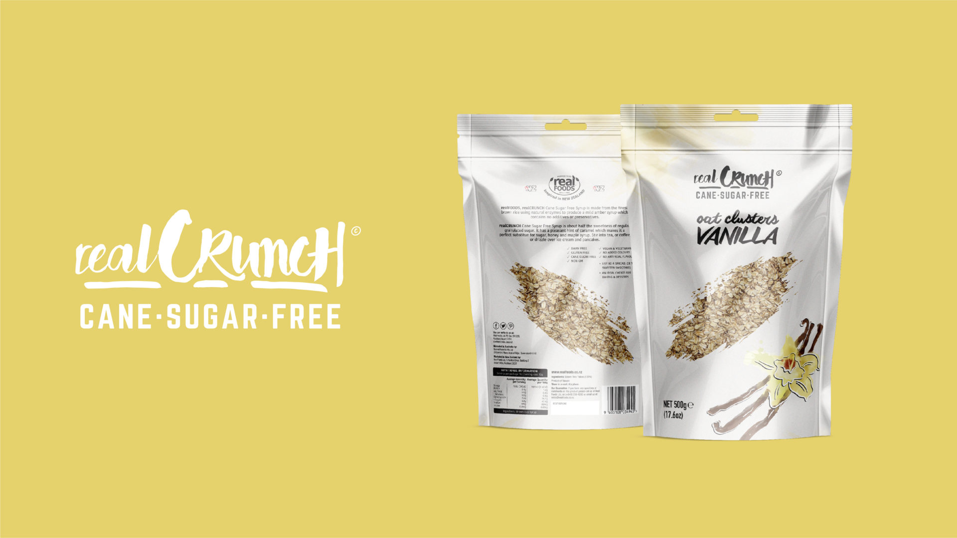
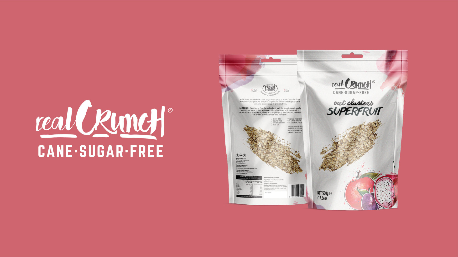
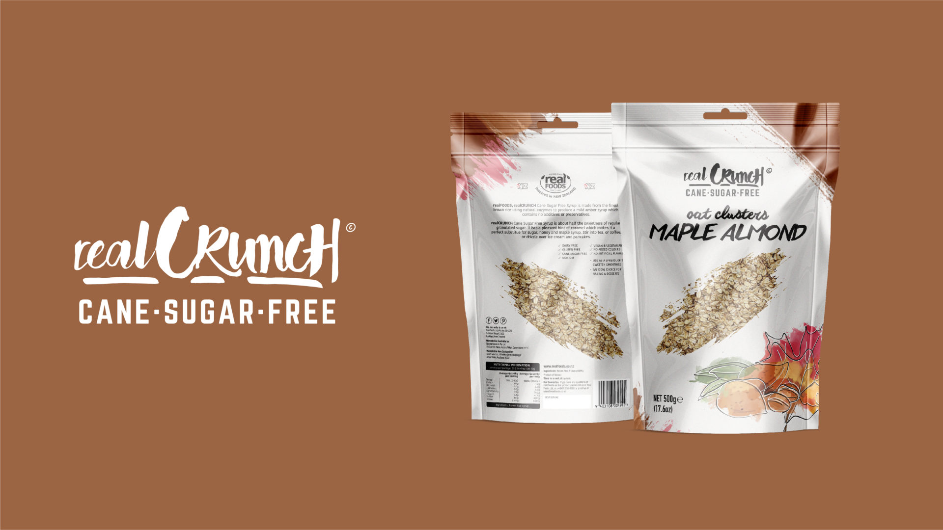
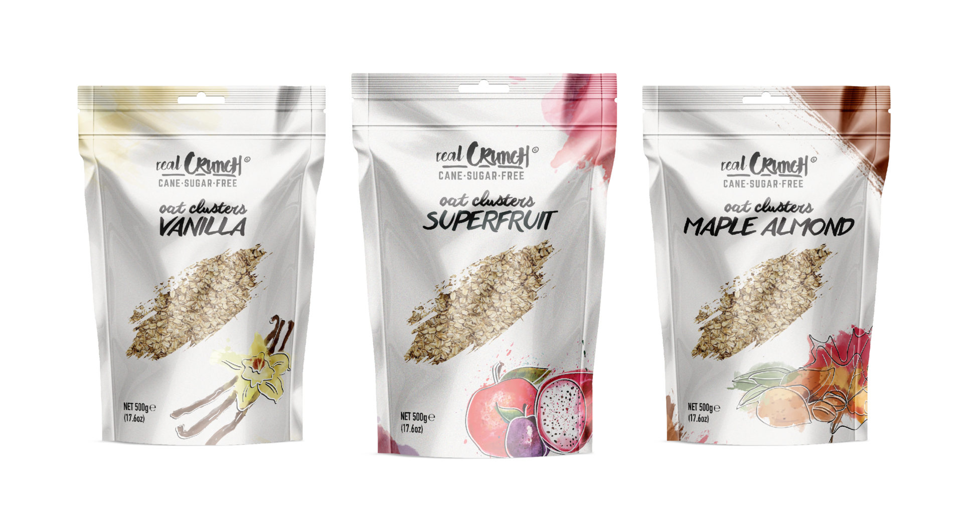
realCrunch was a concept brand created alongside a realSweet, and part of the realFoods family. In creating the packaging and brand for the oat cereal, we wanted to really show the raw and real aspect of the product. We created a splash texture using different colours associated with the flavours – also using this texture to create a window to show the contents of the product.
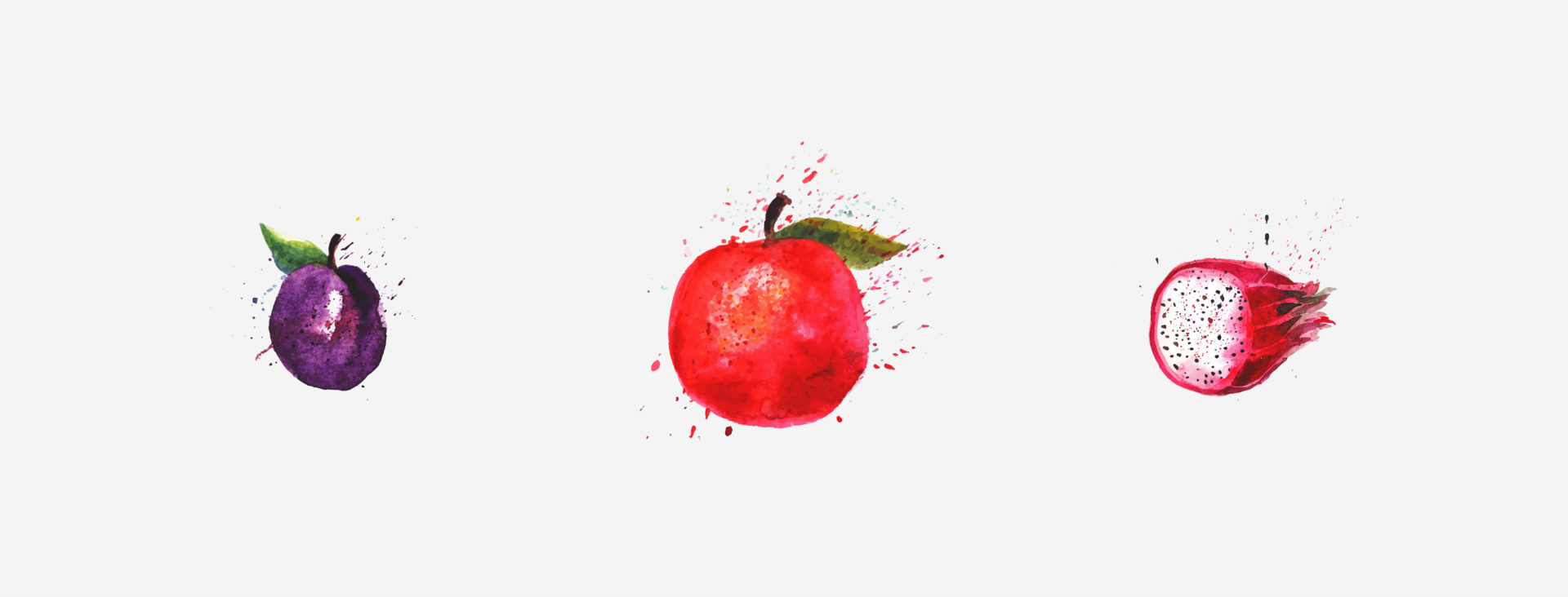
Other major aspects of the brand for realCrunch was the illustration of the fruit and flavours of the product. This style of illustrations again repeats the main idea of showing raw and real, this is done through a water colour style illustration, again using the splash texture.